By Melodae Horst, MA, APR, SHRM-SCP
People interact with typography hundreds of times a day, even if they don’t realize it.
In reviewing daily messaging exposure, people see typography on websites, billboards, road signs, social media and product packaging—but rarely does it cause them to pause and think about the letters and characters. Typography does more than present information. It subtly shapes how we feel, what we remember, and how we act. From trust to tone, the differences in font sizes and weights do more than just look good—they communicate meaning.
Shaping Perception
Typography, the art and technique of arranging text and includes typeface choice, size, spacing and layout. If you are a designer, you use it deliberately, touching everyone and that has impact.
A typeface is a design of letters, numbers and even symbols that carry a certain set of aesthetic qualities or distinct styles. They shape perception because they evoke a certain tone, intent or emotion. For example, if the letters are very bold, they can shout at the reader and get attention. Some typefaces with flourishes or “serifs” can suggest more formality or tradition.
Typography Builds Brand Trust
However, typography isn’t just aesthetic, it can affect trust and readability. A study published in the journal Cognition, from Song & Schwarz found that text written in a hard-to-read font led readers to think a task was more difficult, affecting how they processed and remembered the content.
Typography is central to brand identity. Fonts convey personality: reliable, fun, luxurious, or bold. For example, financial institutions often use serif fonts to establish credibility, while tech brands lean toward clean, sans-serif fonts to suggest innovation.
In research published in MIT Sloan Management Review, people evaluated a website’s credibility within 50 milliseconds—before reading a single word. Visual design, especially typography, played a key role in those snap judgments.
Readability and Accessibility
Good typography improves user experience, especially online. The right line spacing, font weight, and contrast levels can improve comprehension, particularly for people with visual impairments or learning differences.
Organizations like the World Wide Web Consortium (W3C) offer typography guidelines in their Web Content Accessibility Guidelines (WCAG) to ensure inclusive digital experiences.
Examples in everyday life include street signs that need typefaces to be instantly legible. In healthcare, forms benefit from readable type to reduce errors. Advertising relies on typographic hierarchy with headlines that stand out from the rest of the text to grab attention within seconds.
Typography that Matters
Typography is everywhere—and it matters more to us than we think. Whether you’re a designer, marketer, or just someone who opens emails and reads signs, understanding typography can give a new appreciation for how we consume and respond to information.
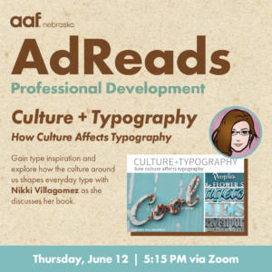
If you want to dive deeper into typography, join us for AdReads and interact with author Nikki Villagomez on June 12 from 5:15–6:15 p.m. CT as we explore Culture+Typography and how geography, environment, and identity shape the way we use type.


